Pilotlog.tech
A mobile-first flight logbook for professional pilots.
A mobile-first application designed to streamline the way professional pilots manage their flight records. Traditionally reliant on paper logbooks or fragmented digital tools, pilots needed a solution that was both intuitive and compliant with aviation standards. The project created a seamless, user-centered experience that simplifies flight tracking while enhancing data accuracy.
The problem
Pilots face challenges maintaining accurate flight logs due to outdated systems, manual entry errors, and lack of synchronization across devices. The goal was to design a digital logbook that not only meets regulatory requirements but also improves usability, reduces cognitive load, and supports pilots in their day-to-day operations.
Key challenges
Regulatory Compliance
Designing around FAA/EASA standards required precision and legal awareness.
Mobile Usability
Pilots needed a fast, intuitive interface usable in post-flight conditions.
Reducing Manual Input
Streamlining repetitive data entry was key to improving efficiency.
Insightful Dashboards
Visualizing flight data clearly without overwhelming users.
Design process
- 01
Discovery & Research
Conducted interviews with commercial and private pilots to map workflows, pain points, and preferences. Audited existing logbook apps for usability gaps and reviewed FAA and EASA regulations to ensure compliance.
- 02
Define & Ideate
Built personas and journey maps to capture user needs. Ideated features including smart flight entry, interactive maps, social sharing and a license tracker.
- 03
Design
Moved from paper sketches to low- and mid-fidelity wireframes, then built a full brand identity, design system, and high-fidelity prototype.
- 04
Test & Iterate
Ran usability sessions with commercial and recreational pilots. Simplified input flows, sharpened icon clarity, raised contrast for low-light readability, and added privacy controls to the post-flight sharing feature.
Mapping the landscape
Before designing a single screen, I benchmarked Pilotlog.tech against the most-used digital logbooks on the market — Flylog.io, the legacy Pilotlog, and Air Pilot Logbook. The audit covered platform coverage, regulatory compliance, data import, navigation tooling, and overall UI maturity. The gap was clear: competitors were either modern but cluttered, or complete but visually dated. That tension framed the entire product direction — feature-rich, regulation-aware, and unmistakably current.
| Flylog.io | Pilotlog | Air Pilot Logbook | |
|---|---|---|---|
| Platform Support | Web, iOS, Android, Mac, Windows | Web, iOS, Android, Mac, Windows | iOS, Android |
| Compliance Standard | FAA, EASA, CASA, TCCA, UKCAA | FAA, EASA, ICAO | FAA, EASA |
| Flight Data Import | Yes | Yes | No |
| Navigation Tools | Yes | No | No |
| User Interface | Modern, clean but cluttered | Feature-rich but dated | Simple but dated |
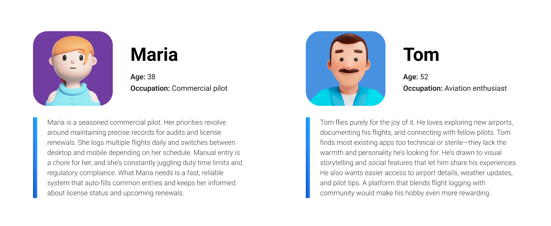
Who we're designing for
Two personas anchored every decision. Maria, a 38-year-old commercial pilot, needs precision, speed, and confidence that her records will hold up to audits and license renewals. Tom, a 52-year-old aviation enthusiast, flies for the love of it and wants warmth, social sharing, and easy access to airport details. Designing for both meant a system that scales from regulated daily logging to lightweight, joyful weekend use — without compromising either.
A logo that earns its altitude
The Pilotlog.tech mark fuses two ideas into one geometric form: a logbook and a plane. The chevron silhouette reads first as a paper aircraft in motion — forward, decisive, gaining altitude — and on second look as an open book turning a page. A confident blue gradient gives it depth and trust, and the mark holds up across light, tinted, and deep navy surfaces so it works wherever the product lives.
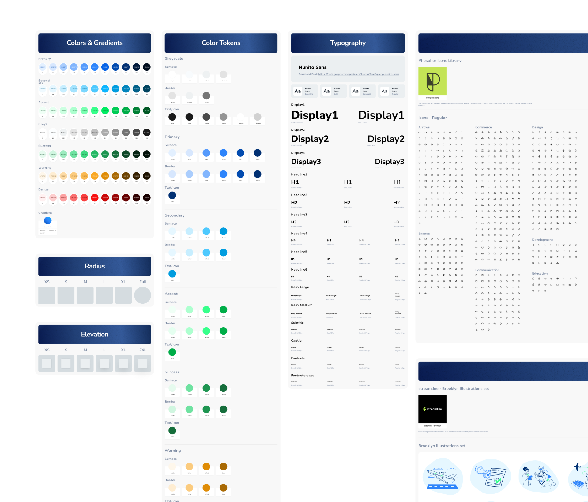
Built from scratch, built to scale
Pilotlog.tech runs on a design system I architected from the ground up — color tokens, gradients, typography scales, radius and elevation primitives, an icon set, and a curated illustration library. Every screen in the product is composed from these foundations, which kept the visual language consistent across dozens of flows and gave the development team a single source of truth to build against. The system was designed to grow with the product, not just ship it.
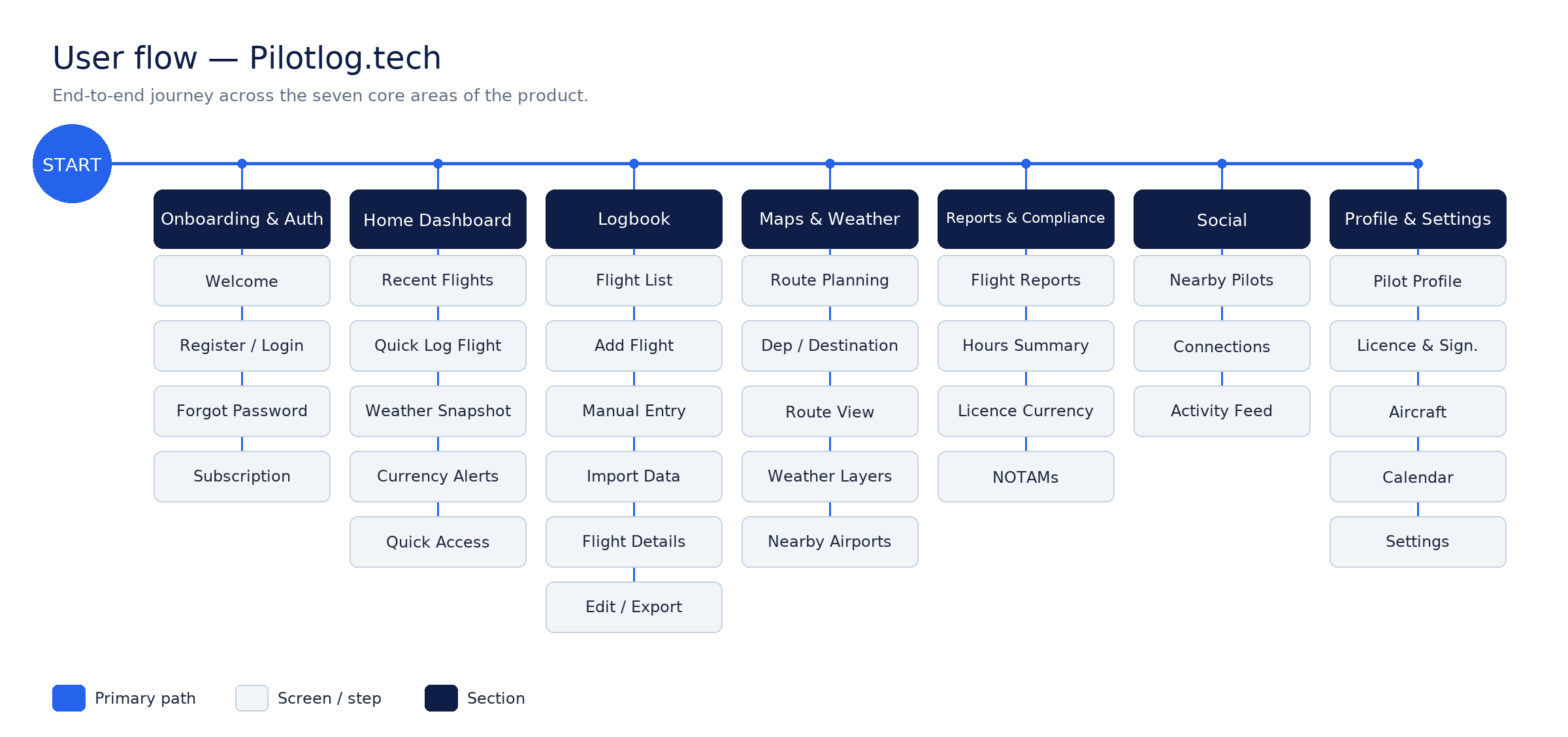
Mapping the journey before the pixels
Before opening Figma, I traced every path a pilot could take through the product — from first launch to logging a flight mid-turnaround. The flow exposed where decisions branched, where friction hid, and where regulation forced extra steps. Locking the architecture early meant the visual design could stay focused on clarity instead of catching up to structure.
Pressure-testing the structure
Grayscale wireframes let me stress-test layout, hierarchy, and interaction patterns without the distraction of color or polish. Each screen was annotated and reviewed with pilots, then iterated until the skeleton held up under real-world tasks: logging a flight one-handed, scanning the logbook in bright sunlight, checking license currency at a glance.
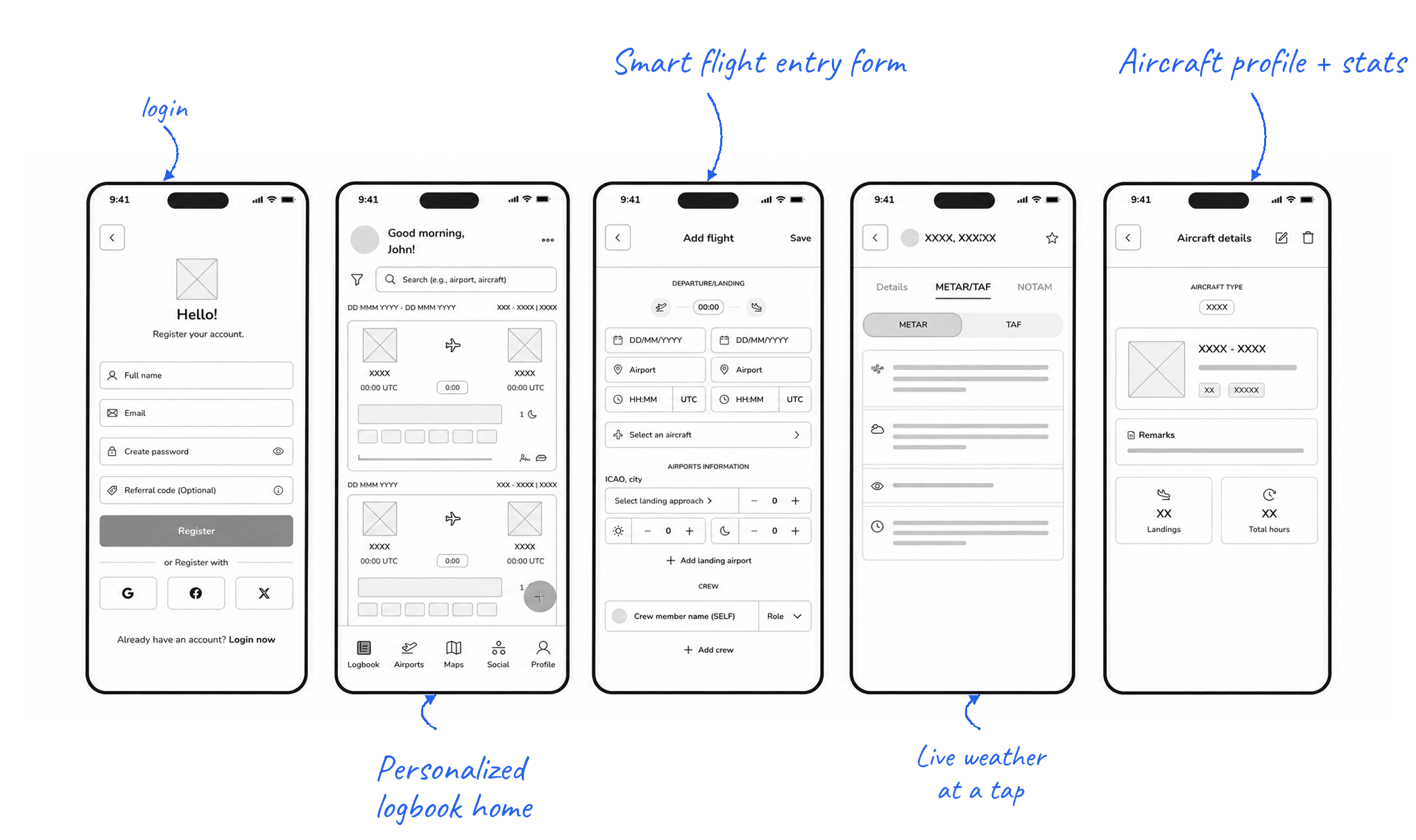
Final designs
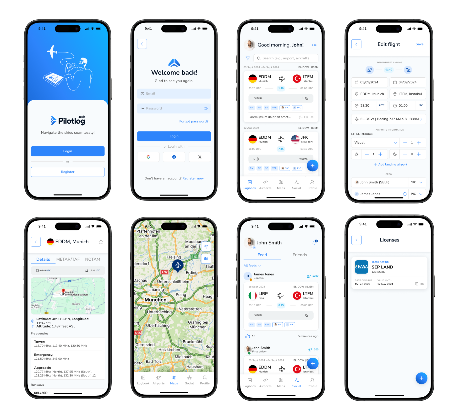
Selected screens from the shipped high-fidelity design — onboarding, logbook, flight entry, airport detail, maps, social feed, and license tracking.
What shipped
Shipped a regulation-compliant logbook that meaningfully reduced time-to-log and earned positive qualitative feedback from pilots across experience levels.
- →Compliance and delight aren't mutually exclusive — clear hierarchy makes regulated forms feel effortless.
- →Real-world testing surfaced field conditions (lighting, fatigue) that no internal review caught.