PRISMaudit
A flexible mobile audit tool built for the field.
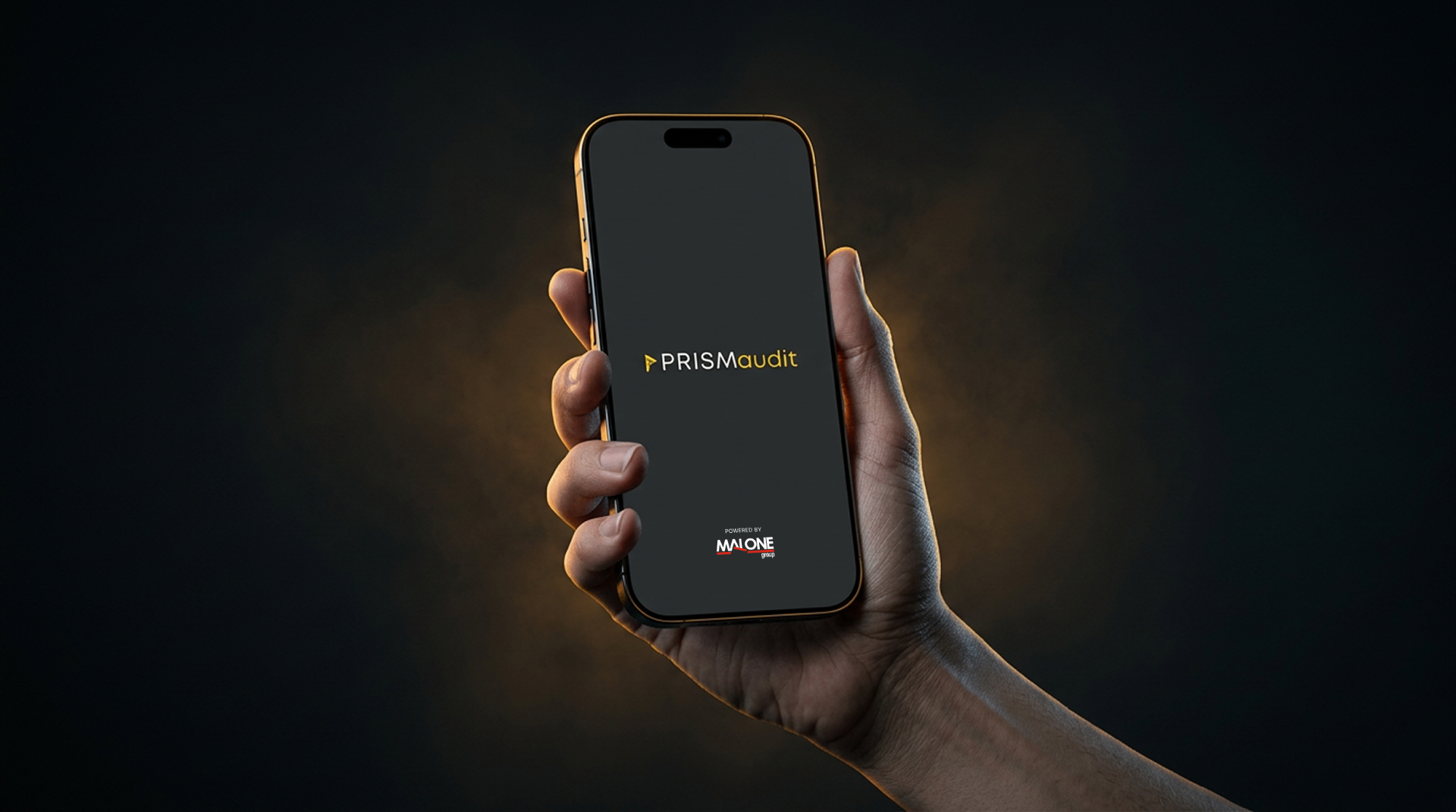
PRISMaudit is a mobile app designed to simplify audits by allowing users to create or customize templates, track progress, and attach notes or images to each question. It supports multiple audit statuses and is built for flexibility and ease of use in the field.
The problem
Auditors need a mobile-first tool that adapts to different workflows and environments. Existing solutions are often rigid or desktop-bound, making on-site auditing inefficient and error-prone.
Key challenges
Flexibility vs. Simplicity
Customizable templates and question types without overwhelming users — required careful hierarchy and progressive disclosure.
Field Usability
Auditors work in noisy, fast-paced environments. The interface had to be clean, responsive, and easy to navigate on the go.
Status Clarity
Communicating audit states (pending, completed, returned) clearly while keeping the interface uncluttered.
No Prototype Testing
The client opted to test only the developed product, so design decisions were validated through internal reviews and heuristic evaluation.
Design process
- 01
Discover & Define
Clarified goals and constraints with stakeholders, analyzed existing audit workflows, and mapped the journey from assignment to submission. Defined the core problem: making audit statuses and progress more transparent.
- 02
Design
Designed clean, minimalist screens aligned to the client's brand. Used color, iconography, and layout to differentiate audit statuses. Developed a comprehensive style guide and refined high-fidelity designs that supported different user roles.
- 03
Evaluate & Refine
Ran a heuristic evaluation to catch usability issues early, refining key interactions and improving overall usability without traditional user testing.
- 04
Deliver & Support
Worked closely with developers to ensure faithful implementation, providing detailed specs and rationale behind key decisions.
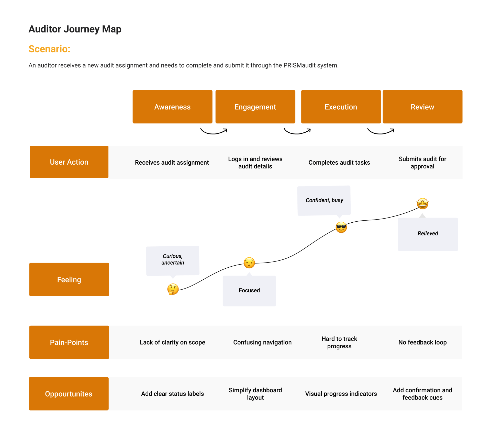
From assignment to submission
I mapped the auditor's experience across four stages — Awareness, Engagement, Execution, and Review — tracking actions, feelings, pain points, and opportunities at each step. The auditor starts curious but uncertain when a new assignment lands, gets focused as they log in and review details, grows confident while completing tasks on-site, and feels relieved on submission. Surfacing this arc made the friction obvious: unclear scope, confusing navigation, hard-to-track progress, and no closing feedback loop — each one a direct brief for the interface.
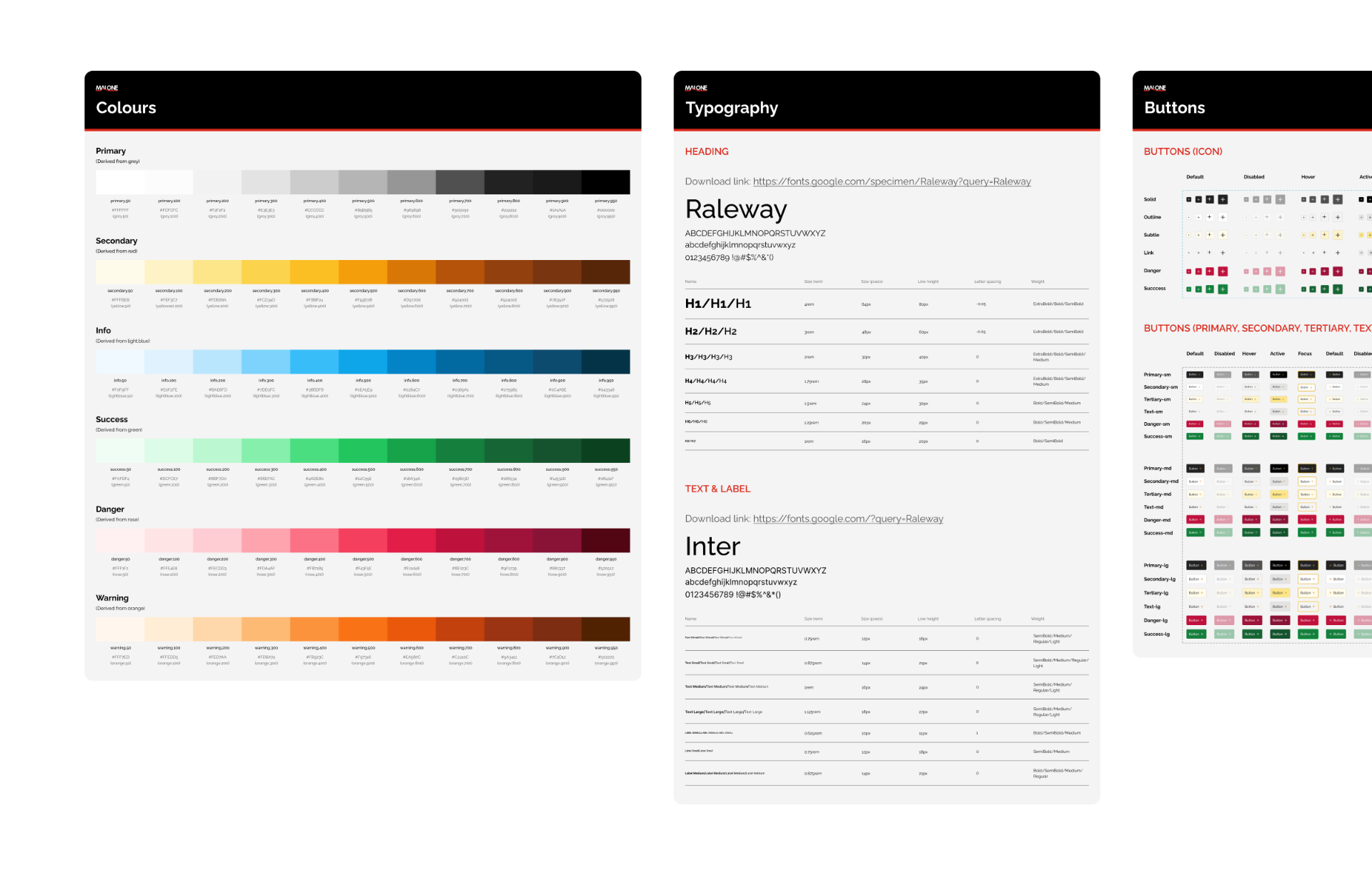
A system aligned to the brand
PRISMaudit runs on a tailored design system — color tokens tuned to the client's brand, a typographic scale built for dense forms, status colors that read instantly in the field, and component primitives that scale across question types, attachments, and review states. The system gave the development team a clear, consistent foundation and kept the product visually coherent as new question types and workflows were added.
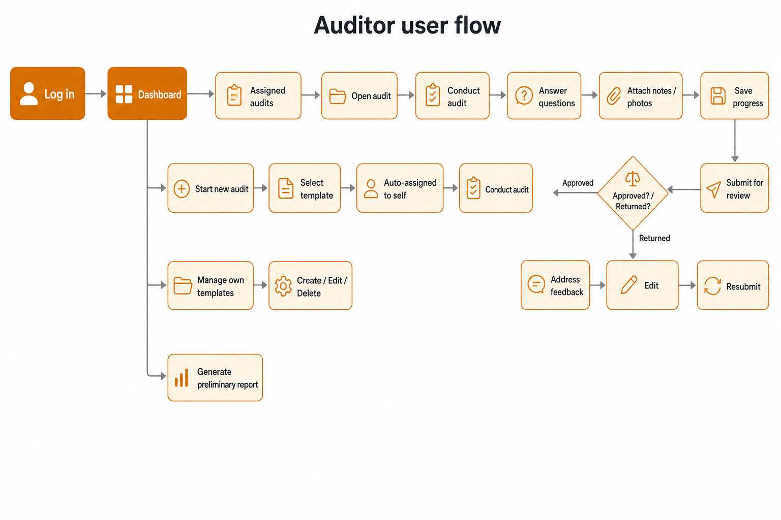
Mapping the audit lifecycle
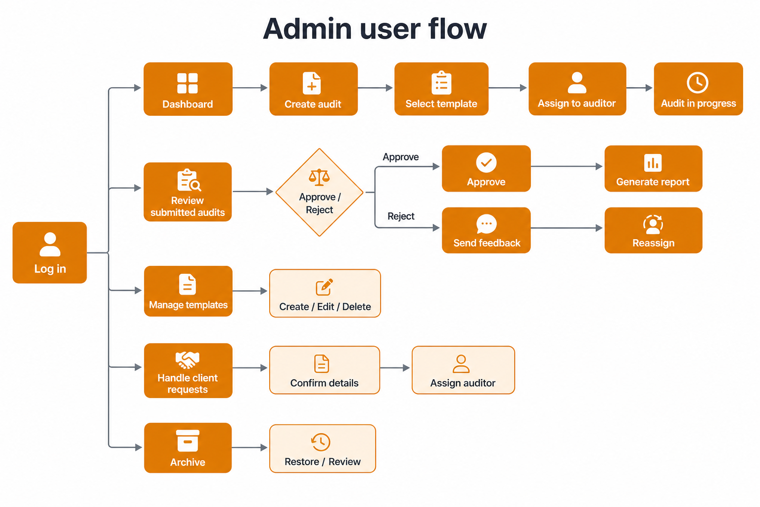
Two roles, two distinct journeys. The Admin orchestrates the system — creating audits, assigning auditors, reviewing submissions, managing templates, and handling client requests. The Auditor lives in the field — picking up assignments, conducting audits, attaching evidence, and resolving feedback when an audit is returned. Mapping both flows side by side exposed where status needed to be communicated, where attachments belonged, and where the interface had to stay out of the way.
Pressure-testing the structure
Grayscale wireframes let me validate layout, hierarchy, and interaction patterns without the distraction of color or polish. Each screen was reviewed against real audit workflows, then iterated until the skeleton held up under field conditions: capturing evidence one-handed, scanning a long checklist, and reviewing a returned audit at a glance.
Final designs
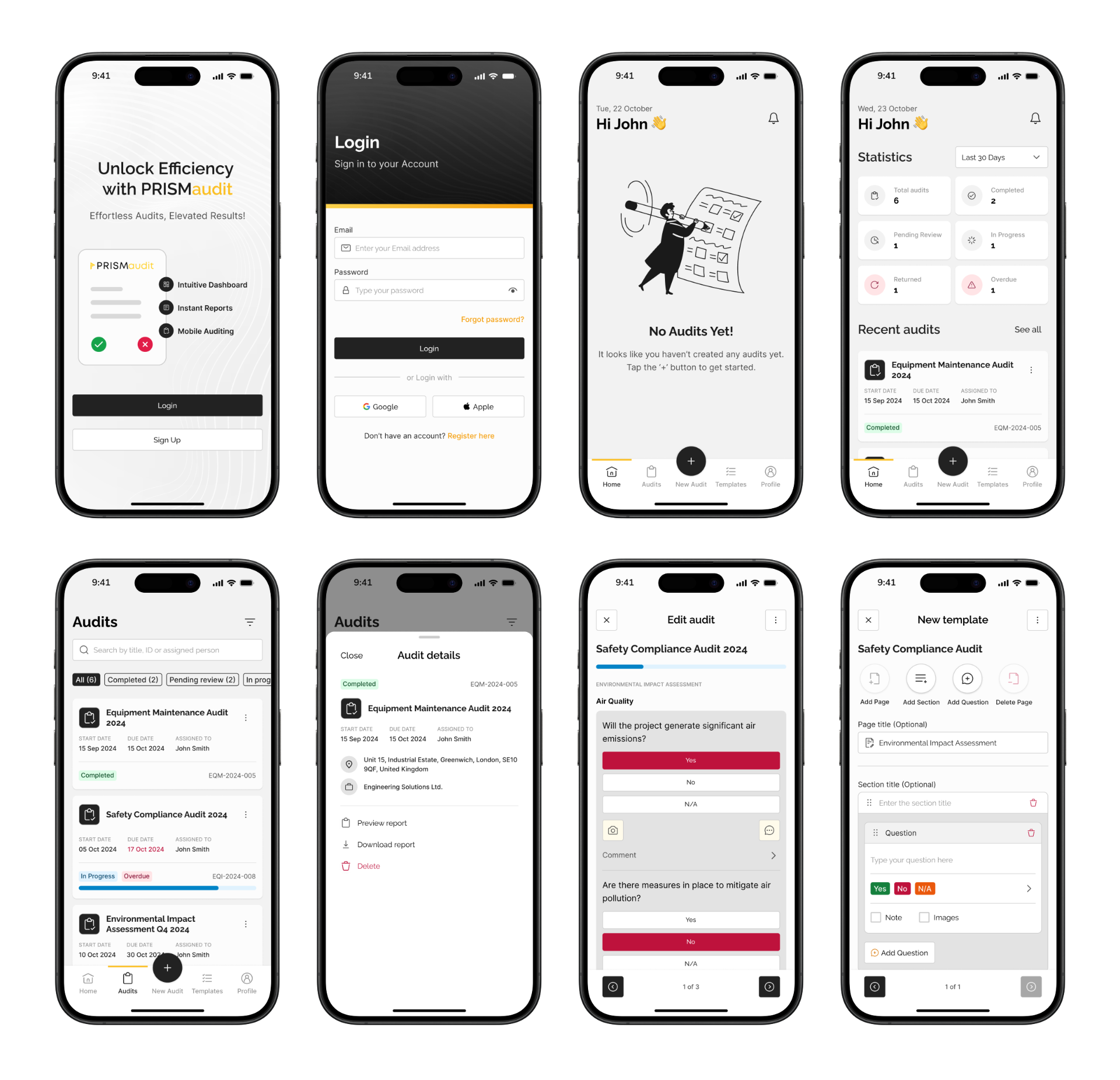
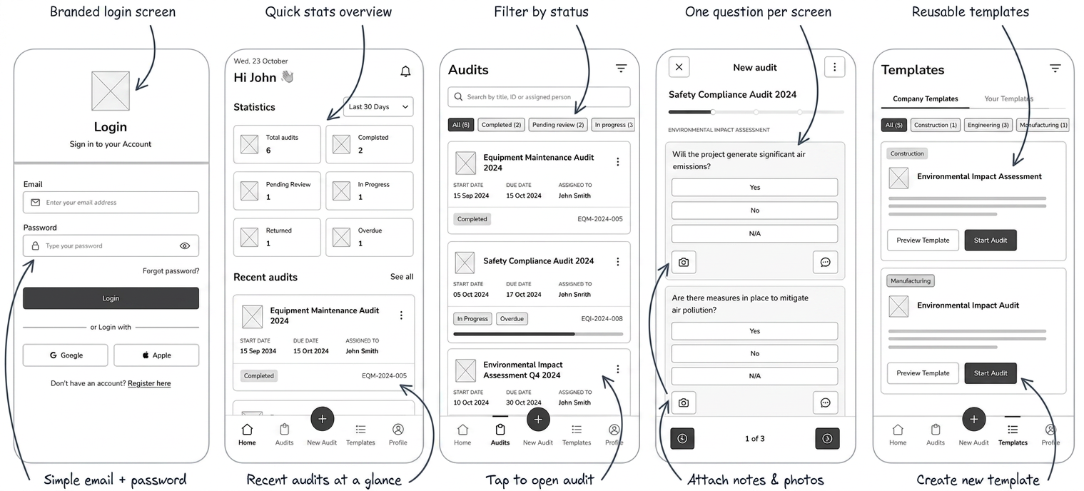
Selected screens from the shipped high-fidelity design.
What shipped
Delivered a flexible audit app with a coherent design system that the development team could ship confidently and that auditors could pick up with minimal training.
- →Heuristic evaluation is no substitute for users, but it raises the floor when testing isn't an option.
- →Status communication is design — most field confusion came down to ambiguous state, not missing features.